
The Fibonacci Timing Pattern — Coding a Reversal Pattern to Trade the Markets
Presenting the Intuition and Code of the Fibonacci Timing Pattern
I am always fascinated by patterns as I believe that our world contains some predictable outcomes even though it is extremely difficult to extract signals from noise, but all we can do to face the future is to be prepared, and what is preparing really about? It is anticipating (forecasting) the probable scenarios so that we are ready when they arrive.
Pattern recognition is the search and identification of recurring patterns with approximately similar outcomes. This means that when we manage to find a pattern, we have an expected outcome that we want to see and act on through our trading. For example, a head and shoulders pattern is a classic technical pattern that signals an imminent trend reversal. The literature differs on the predictive ability of this famous configuration. In this article, we will take a look at the Fibonacci Timing Pattern.
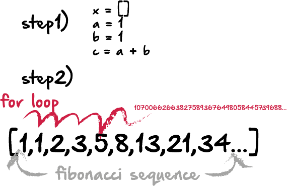
The Fibonacci Sequence
The sequence follows this distinct pattern:
0, 1, 1, 2, 3, 5, 8, 13, 21, 34, 55
The numbers are found by adding the previous two numbers behind them. In the case of 13, it is calculated as 8 + 5, hence the formula is:

OHLC Data Visualization
Candlestick charts are among the most famous ways to analyze the time series visually. They contain more information than a simple line chart and have more visual interpretability than bar charts. Many libraries in Python offer charting functions but being someone who suffers from malfunctioning import of libraries and functions alongside their fogginess, I have created my own simple function that charts candlesticks manually with no exogenous help needed.
OHLC data is an abbreviation for Open, High, Low, and Close price. They are the four main ingredients for a timestamp. It is always better to have these four values in order to better reflect reality. Here is a table that summarizes the OHLC data of a hypothetical security:

Our job now is to plot the data so that we can visually interpret what kind of trend the price is following. We will start with the basic line plot before we move on to candlestick plotting.
Note that you can download the data manually or use Python. In case you have an excel file that has OHLC only data starting from the first row and column, you can import it using the below code snippet:
import numpy as np
import pandas as pd
#Importing the Data
my_ohlc_data = pd.read_excel('my_ohlc_data.xlsx')
#Converting to Array
my_ohlc_data = np.array(my_ohlc_data)
Plotting basic line plots is extremely easy in Python and requires only one line of code. We have to make sure that we have imported a library called matplotlib and then we call a function that plots the data for us.
#Importing the necessary charting library
import matplotlib.pyplot as plt
#The syntax to plot a line chart
plt.plot(my_ohlc_data, color = 'black', label = 'EURUSD')
#The syntax to add the label created above
plt.legend()
#The syntax to add a grid
plt.grid()

Now that we have seen how to create normal line charts, it is time to take it to the next level with candlestick charts. The way to do this is to think in terms of vertical lines. Here are the steps (followed by an application of the function below):
- Select a lookback period. This is the number of values you want to appear on the chart.
- Plot vertical lines for each row representing the highs and lows. For example, on OHLC data, we will use a matplotlib function called vlines which plots a vertical line on the chart using a minimum (low) value and a maximum (high value).
- Make a color condition which states that if the closing price is greater than the opening price, then execute the selected block of code (which naturally contains the color green). Do this with the color red (bearish candle) and the color black (Doji candle).
- Plot vertical lines using the conditions with the min and max values representing closing prices and opening prices. Make sure to make the line’s width extra big so that the body of the candle appears sufficiently enough that the chart is deemed a candlestick chart.

def ohlc_plot(Data, window, name):

    Chosen = Data[-window:, ]

    for i in range(len(Chosen)):

      plt.vlines(x = i, ymin = Chosen[i, 2], ymax = Chosen[i, 1], color = 'black', linewidth = 1)

      if Chosen[i, 3] > Chosen[i, 0]:
            color_chosen = 'green'
            plt.vlines(x = i, ymin = Chosen[i, 0], ymax = Chosen[i, 3], color = color_chosen, linewidth = 4)                          if Chosen[i, 3] < Chosen[i, 0]:
            color_chosen = 'red'
            plt.vlines(x = i, ymin = Chosen[i, 3], ymax = Chosen[i, 0], color = color_chosen, linewidth = 4)

      if Chosen[i, 3] == Chosen[i, 0]:
            color_chosen = 'black'
            plt.vlines(x = i, ymin = Chosen[i, 3], ymax = Chosen[i, 0], color = color_chosen, linewidth = 4)

    plt.grid()
    plt.title(name)# Using the function
ohlc_plot(my_ohlc_data, 50, '')

Creating the Fibonacci Timing Pattern
The pattern combines time, price, and the Fibonacci sequence in order to show whether they provide reversal points or not. Here is the basic intuition:
- For a bullish Fibonacci Timing Pattern, we need 8 closes where each close is lower than the close 5 periods ago, lower than the close 3 periods ago, and lower than the close 1 period ago. Upon the completion of this pattern, we will have a bullish signal. Any interruption in the sequence will invalidate the pattern.
- For a bearish Fibonacci Timing Pattern, we need 8 closes where each close is higher than the close 5 periods ago, higher than the close 3 periods ago, and higher than the close 1 period ago. Upon the completion of this pattern, we will have a bearish signal. Any interruption in the sequence will invalidate the pattern.
First we need to define some primordial functions before we manipulate the data array:
# The function to add a certain number of columns
def adder(Data, times):

    for i in range(1, times + 1):

        z = np.zeros((len(Data), 1), dtype = float)
        Data = np.append(Data, z, axis = 1)                    return Data# The function to deleter a certain number of columns
def deleter(Data, index, times):

    for i in range(1, times + 1):

        Data = np.delete(Data, index, axis = 1)                return Data# The function to delete a certain number of rows from the beginning
def jump(Data, jump):

    Data = Data[jump:, ]

    return Data
def fibonacci_timing_pattern(Data, count, step, step_two, step_three, close, buy, sell):

    # Bullish Fibonacci Timing Pattern
    counter = -1for i in range(len(Data)):
        if Data[i, close] < Data[i - step, close] and \
           Data[i, close] < Data[i - step_two, close] and \
           Data[i, close] < Data[i - step_three, close]:

            Data[i, buy] = counter
            counter += -1

            if counter == -count - 1:
                counter = 0
            else:
                continue

        elif Data[i, close] >= Data[i - step, close]:
            counter = -1
            Data[i, buy] = 0

    # Bearish Fibonacci Timing Pattern
    counter = 1

    for i in range(len(Data)):
        if Data[i, close] > Data[i - step, close] and \
           Data[i, close] > Data[i - step_two, close] and \
           Data[i, close] > Data[i - step_three, close]:

            Data[i, sell] = counter
            counter += 1
            if counter == count + 1:
                counter = 0
            else:
                continue

        elif Data[i, close] <= Data[i - step, close]:
            counter = 1
            Data[i, sell] = 0

    return Data# Using the function
count = 8
step = 5
step_two = 3
step_three = 2my_data = fibonacci_timing_pattern(my_data, count, step, step_two, step_three, 3, 6, 7)
We can add as many columns as we want to the data array, hence, the above puts the bullish and bearish count in column 6 and 7 respectively. Remember, to add enough columns.
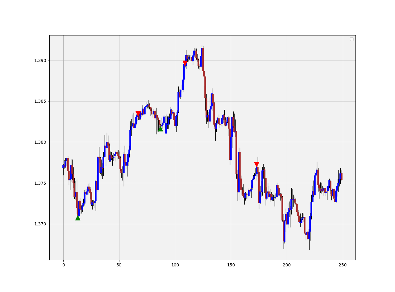
The plot above shows the signals generated on the AUDUSD hourly data. Sometimes, when markets are very choppy, the signals can be less common but during these times, the quality goes up and it tends to be around tops and bottoms. Surely, this is a subjective statement built on personal experience but the visual component of the pattern when applied on the chart is satisfactory. Later on we perform a simple back-test using some special risk management conditions.

On some pairs, it may appear to be more common and due to certain market characteristics and volatility. Sometimes, one move is enough to invalidate a pattern.

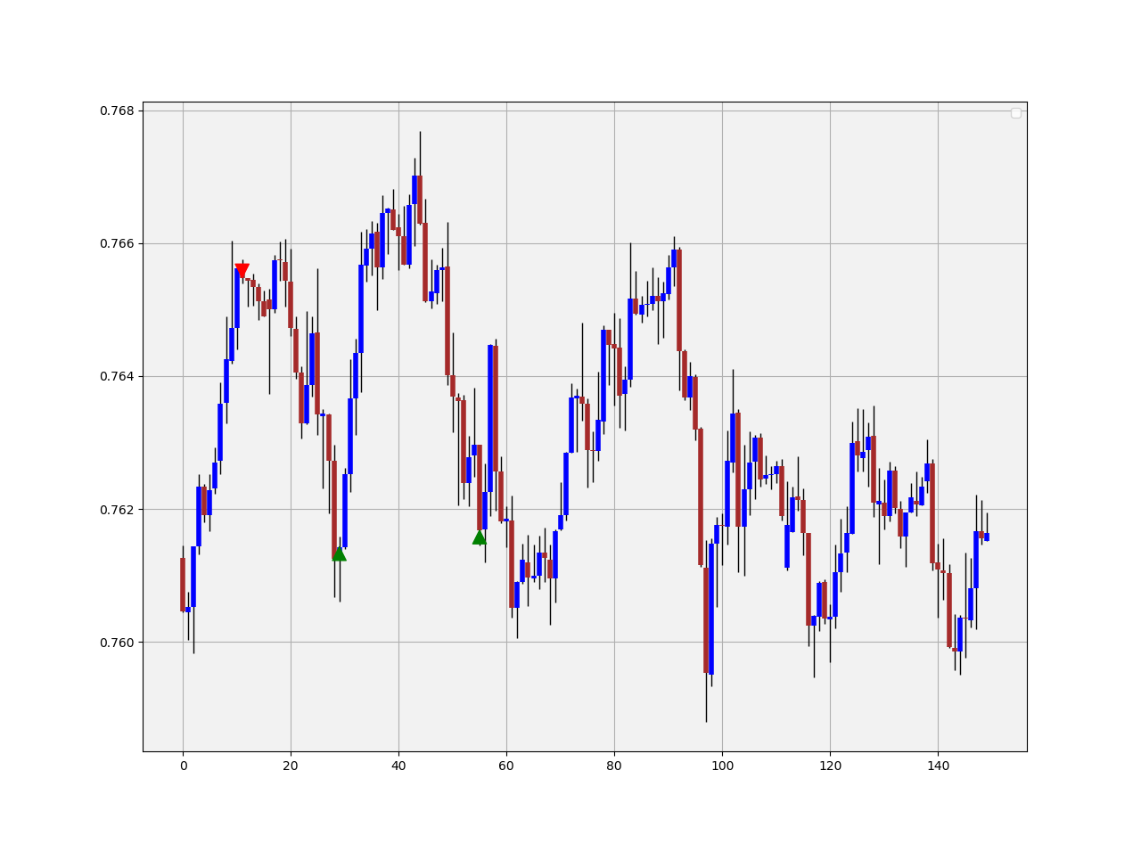
When the market is trending in such a steep angle such as the EURCAD in the chart above, it is unlikely that the signals work. However, we can trade them profitably in this environment. Evidently, this reversal pattern can also be used as a trend-following pattern in the following way:
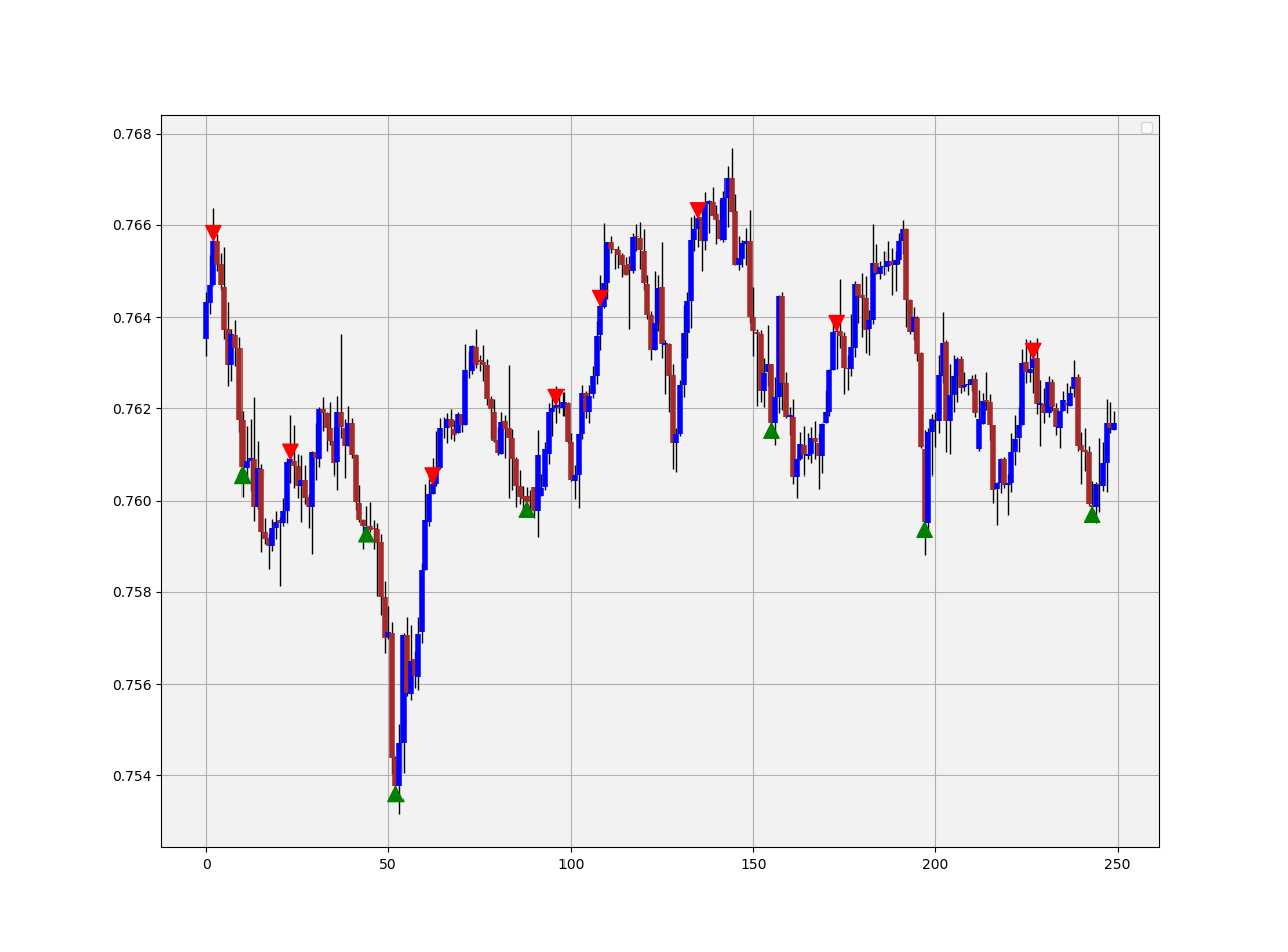
- The bullish pattern is invalidated whenever the market continues below the bullish signal. This condition is valid when the move below the signal equals at least twice the body of the signal candle. This confirms that the downtrend should continue.
- The bearish pattern is invalidated whenever the market continues above the bearish signal. This condition is valid when the move above the signal equals at least twice the body of the signal candle. This confirms that the uptrend should continue.

The above plot shows the AUDCAD in a trend- and range mode. We can notice the difference in the quality of signals between the two regimes. Notice how the first bullish signal actually provided an opportunity to short after it has been invalidated. Nevertheless, how do we choose our target? The target is simply the apparition of a new bullish signal while the stop should be the high of the signal candle.
The Fast Fibonacci Pattern Variation
I have found that in order to increase signals while not necessarily (severely) hurting the predictive power of the pattern, we can tweak the pattern so that it becomes {5, 3, 2, 1}. This means that each time we have five bars where each one is higher than the one 3 periods ago as well as higher than the one 2 periods ago and 1 period ago, we can have a bearish signal. Similarly, each time we have five bars where each one is lower than the one 3 periods ago and lower than the one 2 periods ago and 1 period ago, we can have a bullish signal.
The only adjustment we need to make is in the variables below:
count = 5
step = 3
step_two = 2
step_three = 1
A Simple Back-test with Special Risk Management
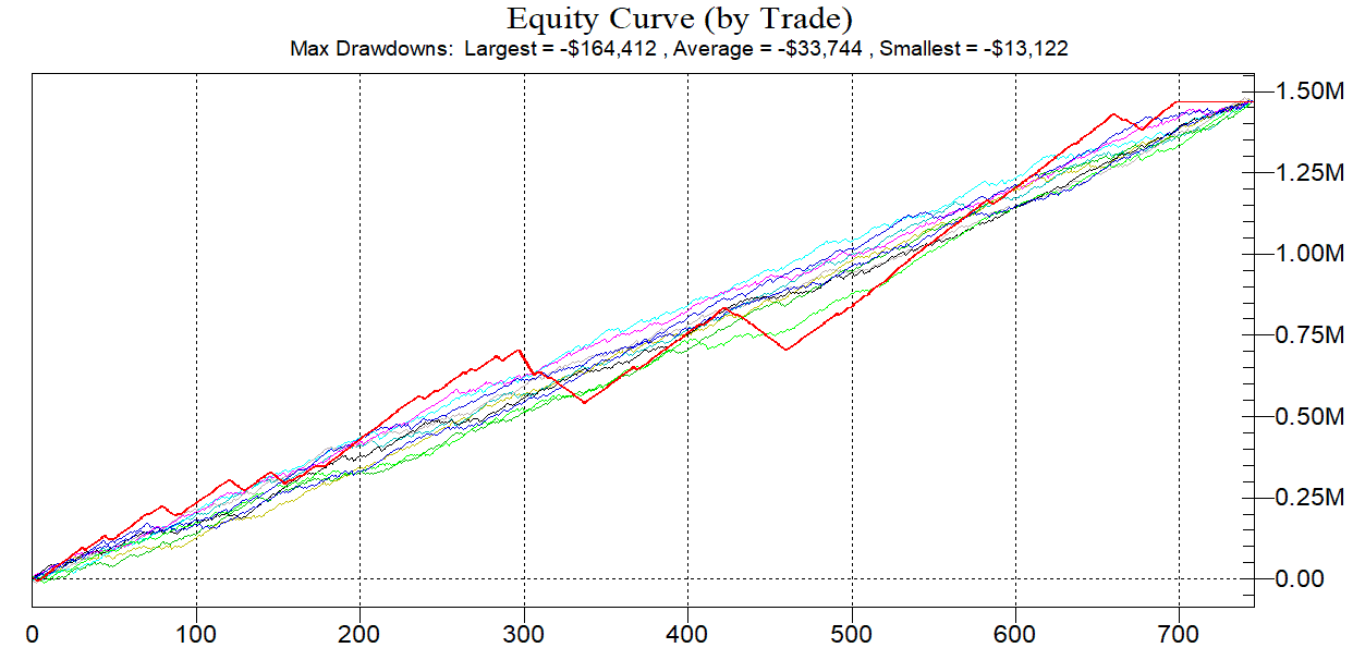
As with any proper research method, the aim is to backtest the indicator and to be able to see for ourselves whether it is worth having an Add-on to our preexisting trading framework. Note that the below code backtests 10 years of historical data for 10 currency pairs. This might not be the optimal time frame for the strategy, but we are just trying to find a one-shoe-size-almost-fits-all strategy.
The conditions of the first strategy are the theoretical ones that are meant as a trend-following technique:
- Go long (buy) whenever the bullish pattern is validated by buying on the close of the candle. Hold this position until getting another signal or getting stopped out by the suboptimal risk management system.
- Go short (sell) whenever the bearish pattern is validated by selling on the close of the candle. Hold this position until getting another signal or getting stopped out by the suboptimal risk management system.
def signal(Data):

    for i in range(len(Data)):

       # Bullish Signal
       if Data[i, 6] == -count:
           Data[i, 8] = 1

       # Bullish Signal
       if Data[i, 7] == count:
           Data[i, 9] = -1
One key word mentioned above is “suboptimal” risk management. As a condition of the backtest, we will be using a 1:10 theoretical risk-reward ratio, meaning that we will be risking $10 to gain $1. I sometimes enforce this rule on my algorithms to deliver better returns. The cost per trade is 0.5 pips and the analyzed currency pair is the GBPUSD.
Note that when we have such a low risk-reward ratio, we can have a hit ratio of 90% but this does not mean that the strategy will be a winner. Remember the magnitude of the losses relative to the gains. Let us see the results since 2010 on hourly data.
-----------Performance----------- GBPUSD
Hit ratio       =  92.37 %
Net profit      =  $ 4025.45
Expectancy      =  $ 3.08 per trade
Profit factor   =  1.4
Total Return    =  402.54 %Average Gain    =  $ 11.59 per trade
Average Loss    =  $ -99.96 per trade
Largest Gain    =  $ 55.6
Largest Loss    =  $ -335.1Realized RR     =  0.12
Minimum         = $ 801.8
Maximum         = $ 5105.95
Trades          = 1310

Conclusion
Why was this article written? It is certainly not a spoon-feeding method or the way to a profitable strategy. If you follow my articles, you will notice that I place more emphasize on how to do it instead of here it is and that I also provide functions not fully replicable code. In the financial industry, you should find the missing pieces on your own from other exogenous information and data, only then, will you master the art of research and trading. I always advise you to conduct proper backtests and understand the risks related to trading.