Python: How I Used Simple Technical Analysis to Improve Bitcoin Price Prediction
This article is going to be slightly different than usual. For people following me for a few months, you must have seen different articles or videos where I am using math, science and probability to help predict the market.
Lately, I started to take an interest in cryptocurrencies. Seems like the hype is here and everyone is writing about it – so am I. Before jumping to the code and backtest results let’s start with some basics and discuss how these trading signals are calculated.
Moving averages and trend following
For people familiar with technical analysis, the golden cross and death cross are nothing else than moving averages.
Both moving averages are calculated by adding a stock’s prices over a certain period and dividing the sum by the total number of periods.

Our approach combines two moving averages – a short and long term moving average – to get the long term trend for our cryptocurrency. The buying or selling signals occur when either the short-term moving average crosses above or below the long-term moving average.
These indicators are amazingly simple but can prove effective under certain conditions. Remember, in a self-fulfilling prophecy an individual’s expectations about another person or entity eventually result in the other person or entity acting in ways that confirm the expectations. Translated into trader language, if enough people belief in something or act in certain ways because of an indicator or some other variable the “prophecy” will actually become true and the market will behave exactly as expected.
Now that we have covered a bit of a background let’s do some backtests and see what results we get.
Prerequisite:
First, let’s install Python 3 and the following packages:
- Pandas
- NumPy
- Yfinance
- Plotly (Not mandatory, but useful for plotting)
If any of these packages are not already installed, you can use the pip command, as shown below.
pip install pandas
pip install numpy
pip install yfinance
pip install plotly
Data pipeline & modelling:
Now that we installed the required packages we can discuss how to process the data.

Steps:
- Query live cryptocurrency’s data using Yahoo Finance API.
- Define time period, create new columns for additional variables, and update these values each second.
- Draw the graph and check if the signals are accurate.
Now that we have a clear plan for our model, we can start coding!
If you already have experience with Python, you can jump to the second step. The first step discusses importing packages.
Step 1: Import required packages.
The first step will consist of importing the necessary packages.
#Raw Package
import numpy as np
import pandas as pd

#Data Source
import yfinance as yf

#Data visualization
import plotly.graph_objs as go
Step 2: Get live market data.
We will use BTC-USD to set up our data import through Yahoo Finance API.
Yahoo Finance API needs arguments:
- Tickers (1)
- Start date + End date or Period (2)
- Interval (3)
For our use case, the ticker (argument 1) is BTC-USD. We select the 7 last days as the time period (argument 2). And set up an interval (argument 3) of 90 minutes.
To call your data, you do the following:
yf.download (tickers=argument1, period=argument2, interval=argument3)
A quick lookup on the possible intervals:
Detailed below the full list of intervals and the data you can download via the yahoo api:

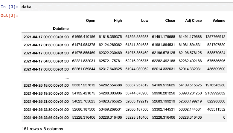
Now that we have defined the arguments, let’s execute the query and check the output:
data = yf.download(tickers=’BTC-USD’,period = ‘8d’, interval = ’90m’)
Output:
III. Deploy our algorithm
Now that our live data has been downloaded and stored in a variable called “data” the next step consists of calculating our moving averages and setting up our buy & sell signals.
We need to calculate the following:
- MA(5)
- MA(20)
To do so, we will use the rolling function incorporated within Python to get the average value of last n periods closing prices. Using MA(5), we will trade during the 5 last 90 minute periods. This means that we will calculate the average closing price of the last 7 hours and 30 minutes (5 times 90 minutes).

For the MA(20), we will use the rolling function and calculate the average of last 20 closing prices.
Here is the Python code:
#Moving average using Python Rolling function
data['MA5'] = data['Close'].rolling(5).mean()
data['MA20'] = data['Close'].rolling(20).mean()
The code above, once executed, will create 2 new columns for your data frame, as shown below:
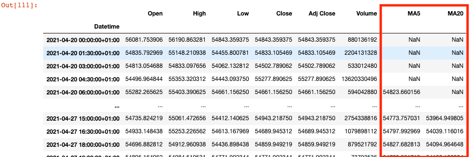
We can finally deploy our strategy and test it.
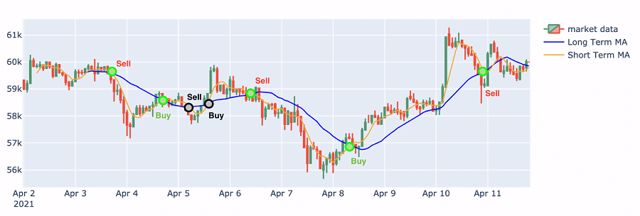
Draw this graph live
The last step consists of plotting our data and check if we can predict price trends with a satisfying probability. I have recorded this part in the video below:
Boom! We made it.
Below is an output of some of the trading signals generated.
Here is the full python code:
# Raw Package
import numpy as np
import pandas as pd
#Data Source
import yfinance as yf
#Data viz
import plotly.graph_objs as go

#Importing market data
data = yf.download(tickers='BTC-USD',period = '8d', interval = '90m')

#Adding Moving average calculated field
data['MA5'] = data['Close'].rolling(5).mean()
data['MA20'] = data['Close'].rolling(20).mean()

#declare figure
fig = go.Figure()

#Candlestick
fig.add_trace(go.Candlestick(x=data.index,
                open=data['Open'],
                high=data['High'],
                low=data['Low'],
                close=data['Close'], name = 'market data'))

#Add Moving average on the graph
fig.add_trace(go.Scatter(x=data.index, y= data['MA20'],line=dict(color='blue', width=1.5), name = 'Long Term MA'))
fig.add_trace(go.Scatter(x=data.index, y= data['MA5'],line=dict(color='orange', width=1.5), name = 'Short Term MA'))

#Updating X axis and graph
# X-Axes
fig.update_xaxes(
    rangeslider_visible=True,
    rangeselector=dict(
        buttons=list([
            dict(count=3, label="3d", step="days", stepmode="backward"),
            dict(count=5, label="5d", step="days", stepmode="backward"),
            dict(count=7, label="WTD", step="days", stepmode="todate"),
            dict(step="all")
        ])
    )
)

#Show
fig.show()
Final thought
Even if all the trades have not been perfect, and sometimes we tend to enter or exit the market with a lag, the moving average strategy discussed above has proven to be useful during periods of clear market trends.
The strategy results including slippage give us a return of 7.1% while Bitcoin had a gain of 1,7% during the same week.
🚀Happy coding!
Sajid