
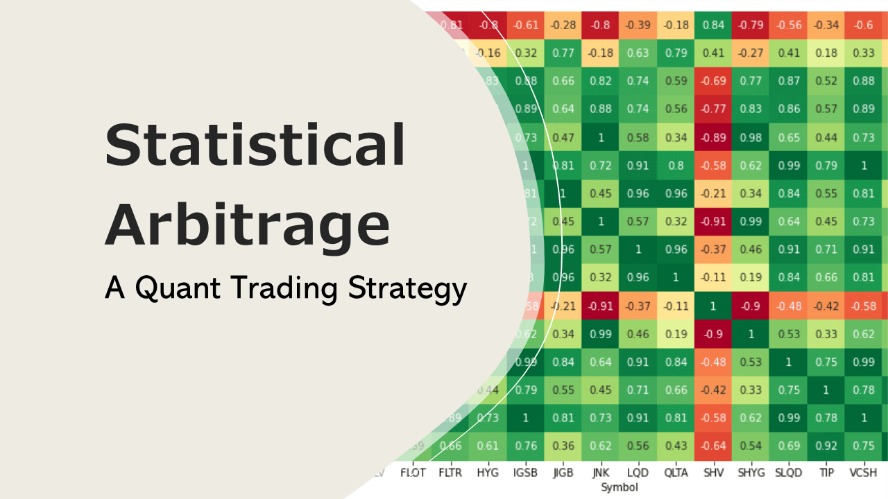
How useful are Moving Averages – Backtest Results
How can we know if moving averages are effective? Can a moving average tell us whether a trend will continue or not? Is the golden cross really useful in predicting trend reversals? What about predicting bear markets with a moving average crossover?
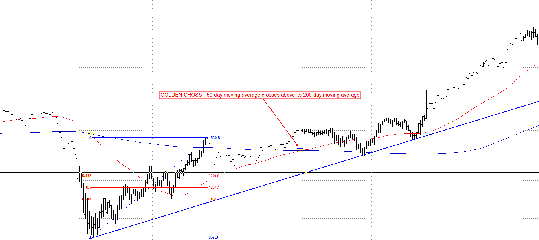
First of we start by defining what a moving average is and what it is used for. Basically, it is a statistic that captures the average change in a time series over a time period. They are calculated to find the trend direction or a trend reversal and are a popular indicator among technical analysts. Since it is based on past price data we can categorize it as a lagging indicator. If we increase the time period for the moving average the lag will increase as well. A widely followed setup by traders and financial analysts is the 50-day and 200-day moving average, known as the golden cross. It occurs when the 50-day moving average crosses above its 200-day moving average. Among the investing crowd it is considered the holy cow of moving averages. On the contrary, short moving averages are used for short-term trading. There is no right or wrong when using moving averages. The only problem with this approach though is that most market participants use it blindly and without prior backtesting. So most traders don’t really know if it works or not except for those who have been using it for years or even decades and those who have done their homework and backtested various moving average setups.
The sophisticated trader should usually avoid relying on a single technical indicator when deciding on whether to enter a trade or not. However, there is also the phenomenon of the self fulfilling prophecy, if enough market participants believe that the golden cross marks a trend reversal it might actually become true.
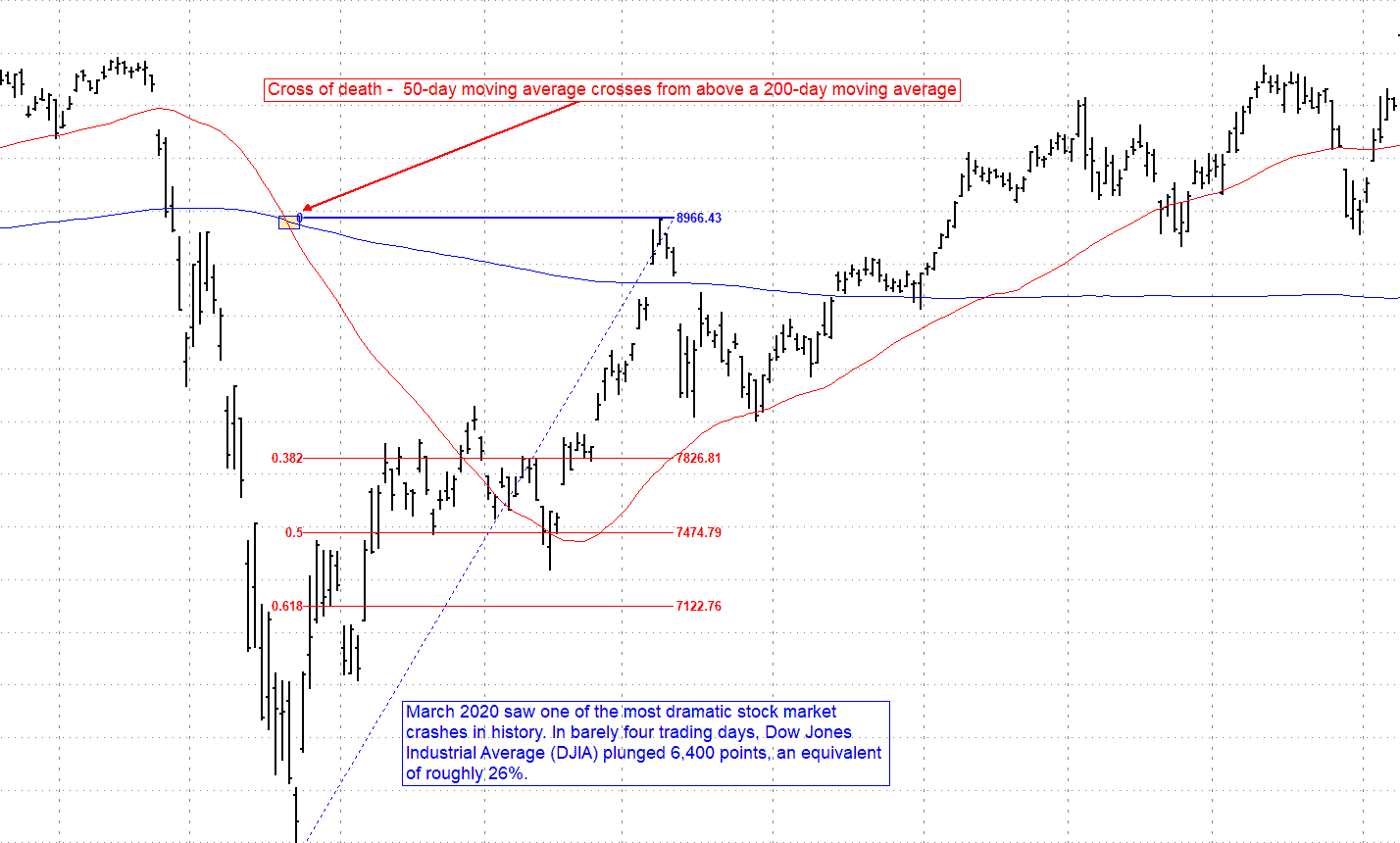
The opposite of the golden cross is the death cross. It occurs when a security’s 50-day moving average crosses from above a 200-day moving average. The name of the indicator comes from its alleged strength as an indication for a bearish market. The formation of a death cross consists of three phases:
- Security’s uptrend reaches a peak and momentum starts to diminish.
- Decline in price to a point where the 50-day moving average falls below the 200-day moving average.
- The last phase is a continuation of the downtrend. If the downtrend is short lived the cross of death is considered a false signal.
Professionals consider the death cross a more reliable indicator if it’s confirmed by high trading volume. The chart below shows a death cross occurring in the Dow Jones Index during the official start of the pandemic in March 2020.
The most commonly used setup to identify a death cross are the 50-day and 200-day moving average. Another popular variation of this signal is a 20-day moving average downside cross of the 50-day moving average. The most prominent death cross patterns occurred in the Dow Jones Industrial Average which preceded the crash of 1929 and in the S&P 500 Index in May of 2008, four months before the housing bubble burst.
Let’s move on to testing these patterns comparing it to real world results.
Strategy:
- Down Jones Index Components –
| Ticker | Company |
| VZ | Verizon Communications Inc. |
| WBA | Walgreens Boots Alliance, Inc. |
| HON | Honeywell International Inc. |
| JNJ | Johnson & Johnson |
| MCD | McDonald’s Corporation |
| AMGN | Amgen Inc. |
| MMM | 3M Company |
| GS | The Goldman Sachs Group, Inc. |
| PG | The Procter & Gamble Company |
| WMT | Walmart Inc. |
| CSCO | Cisco Systems, Inc. |
| MRK | Merck & Co., Inc. |
| JPM | JPMorgan Chase & Co. |
| UNH | UnitedHealth Group Incorporated |
| KO | The Coca-Cola Company |
| TRV | The Travelers Companies, Inc. |
| HD | The Home Depot, Inc. |
| IBM | International Business Machines Corporation |
| V | Visa Inc. |
| BA | The Boeing Company |
| CRM | salesforce.com, Inc. |
| MSFT | Microsoft Corporation |
| CVX | Chevron Corporation |
| APPL | Apple Inc. |
| AXP | American Express Company |
| DOW | Dow Inc. |
| INTC | Intel Corporation |
| NKE | NIKE, Inc. |
| CAT | Caterpillar Inc. |
| DIS | The Walt Disney Company |
- Time Frame: Daily Bars
- Date Range: 12/30/1980 – 02/23/2020
- In Sample Testing – static moving average length (golden cross for long entry and death cross for short entry)
- Stop loss/Profit target – $3500
- $10,000 per trade
- Allow pyramiding – multiple entries into a position can be taken (max 5 positions)
- Monte Carlo Simulation for robustness testing and per trade analysis
Golden Cross Long only backtest results:
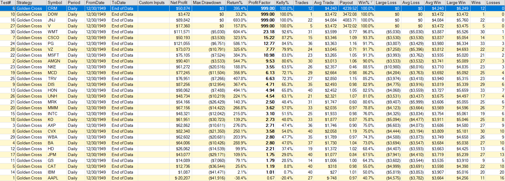
Analyzing all 30 components the test results reveal a high return across the board. All stocks have a winning percentage of above 50 % with the exception of IBM and Apple. To our surprise the percentage of profitable trades is above 60% for all other stocks and for Walmart, Johnson & Johnson and salesforce.com its even 100% respectively.
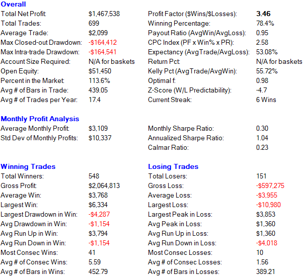
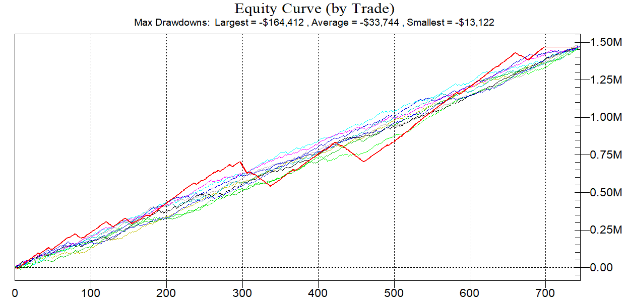
The combined performance summary gives us a winning percentage of 78 % and a profit factor of 3.46. We have a total of 548 winners and 151 losers. The annualized Sharpe ratio is slightly above 1 and can be considered acceptable.
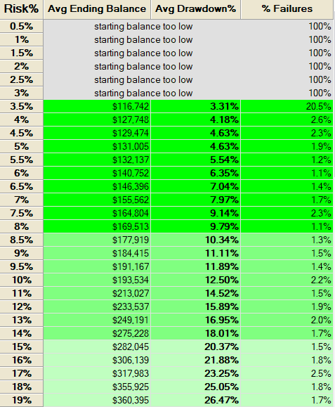
Could the backtest reports be fooling us ? The monte carlo analysis shows a positive expectation and the equity curve doesn’t depend on any particular order of trades. The red colored line represents the original equity curve. The system is robust and meets our risk requirements. The Monte Carlo results have shown that starting with a $100,000 account and a 8% risk limit we have a 1.1% chance of ruin and a median drawdown of 9.79% .
Death Cross Short only backtest results:
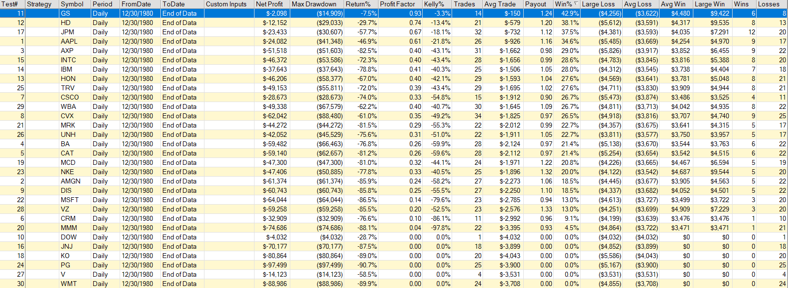
For the tested time period (12/30/1980 – 02/23/2020) the results are as expected. The death cross is everything else then a reliable indicator. As shown in the image below the only time it predicted the beginning of a bear market was during the dotcom bubble which destroyed $6.2 trillion in household wealth over the next two years and the housing market crash which vaporized the value of real estate owned by U.S. households by nearly $6 trillion.
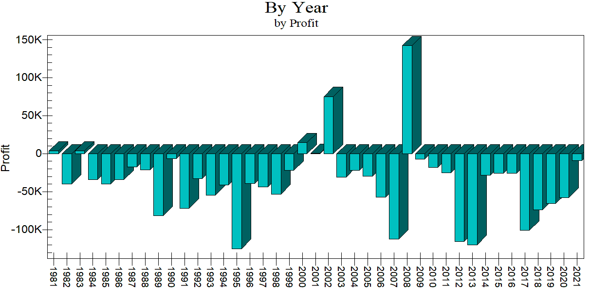
Conclusion: Clearly the death cross is useless for predicting bear markets or any kind of trend reversal. The indicator correctly predicted a trend reversal in only 2 instances in 41 years. If someone tells you that the death cross is such a reliable and wonderful indicator print out the image above and hold it in front of his nose. On the other hand the golden cross seems to be the one that we want to use for spotting bullish market momentum. The indicator is reliable with correct predictions 78 percent of the time. However, keep in mind that the indicators performance can be mainly attributed to the fact that the long term trend of the Dow Jones Index is positive. Since we are using a long term bullish trend indicator in a market with a long term upward trend it becomes a self fulfilling prophecy.