Interest Rate Dynamics: Assessing the Impact of Recent Rate Hikes
Considering the Post-Hike Scenario
The Federal Reserve may be approaching the end of one of the most aggressive monetary tightening campaigns in decades a potential turning point that has investors asking: what usually happens next?
History offers some guidance, but it’s far from consistent. That’s because post-hike market reactions have been shaped by wildly different macro conditions, inflationary pressures, and secular cycles. There is no one-size-fits-all playbook and assuming one exists can be dangerously misleading.
Examining Historical Patterns: Proceed with Caution
There have been 14 major rate-hiking cycles since the inception of the S&P 500 in 1928. While that may seem like a decent sample, it’s statistically small and covers a wide spectrum of economic backdrops from the Great Depression and stagflation to tech booms and quantitative easing. That limited dataset means investors must be cautious when looking for consistent post-hike patterns to inform their decisions.
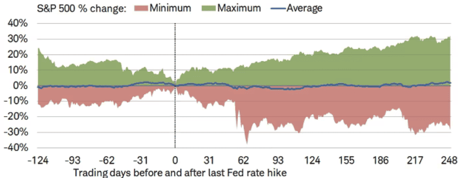
Analyzing S&P 500 Trajectories After the Final Hike
It’s possible to chart an average S&P 500 path starting six months before the final hike and continuing out to one year after. On average, we observe:
- Weakness leading into the final hike
- A brief recovery immediately afterward
- A larger sell-off around 100 trading days post-hike
But beware: averages mask reality. The actual outcomes across those 14 cycles span a vast range from +30% to -30% in the year following the final hike.
Wide Range of Outcomes: Don’t Trust the Average
Historical outcomes diverge wildly. In some cycles, markets roared higher (e.g. 1995, 2018), while others ended in catastrophic declines (e.g. 1929, 2000). Here’s a striking visual:
- Best One-Year Gain: +32.1% (1995)
- Worst One-Year Loss: -28.6% (1929)
The point? There is no “typical” result. Relying solely on average outcomes risks oversimplifying the broader context, especially when inflation, geopolitical shifts, and valuation extremes are all at play.
Historical Insight: When 70/30 Outperformed 60/40
During periods of pronounced market downturns, increasing equity exposure (e.g. shifting from a 60/40 to a 70/30 U.S. stock/bond mix) often led to stronger returns. However, this was not universally true especially in periods marked by elevated inflation and persistently high interest rates.
“This Time Is Different” And That May Be True
Let’s confront a common misconception: that the final Fed rate hike is typically bullish for stocks. While many headlines suggest this, the so-called average path never occurred in any individual cycle. In fact, most post-hike paths deviated sharply from the mean.
No Consistent Pattern to Post-Hike Market Moves
There’s no reliable link between the date of the final rate hike and forward S&P 500 performance whether measured 6 or 12 months out. Nor is there a dependable lag between the last hike and the first rate cut. This reinforces a critical truth:
“Analysis of an average can lead to average analysis.”
Monetary policy is just one variable in a complex ecosystem of drivers. Every cycle is shaped by its own macro and market backdrop.
How This Cycle Is Already Different
Let’s compare to recent hiking cycles:
- 2015–2018: Stocks rallied throughout the rise cycle.
- 2004–2006: Markets climbed steadily during hikes.
- 1999–2000: A strong rally turned into a crash but after the hikes ended.
Now consider 2022–2023: Stocks were hammered during the first six months of the cycle a stark departure from prior patterns. That divergence alone suggests the current cycle doesn’t neatly fit past models. Fast forward to 2024–2025, and markets are still grappling with heightened uncertainty. Sticky inflation, renewed rate volatility, and a dramatic political shift with Trump’s return to office in 2025 have only added fuel to the fire. That divergence alone suggests the current cycle doesn’t neatly fit past models it’s breaking the mold in real time.
A Look Back at Key Post-Hike Outcomes
- 1995: S&P 500 surged +32% one year after the final hike, aided by a rare soft landing and a powerful secular bull market.
- 2018: A sharp pivot to cuts helped lift stocks +27.3%, but inflation was not a major concern at the time.
- 2006: Stocks gained +18.3% post-hike but it was a temporary reprieve before the 2008 crash.
- 2007: The S&P peaked within weeks of the first rate cut, then plunged.
- 2000: Markets fell -15% one year post-hike the start of a secular bear market.
- 1929: The index dropped -28.6% in the year after the Fed’s final hike signaling the onset of the Great Depression.
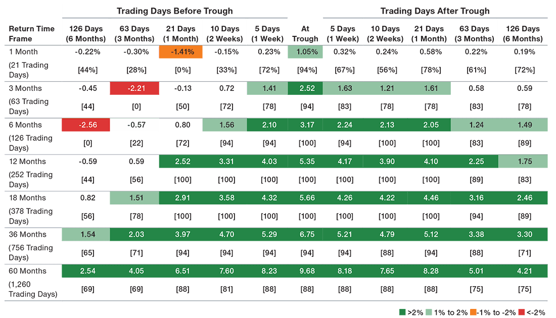
Enhancing Returns During Market Downturns: The Impact of U.S. Equity Exposure
Figure 2: Average Cumulative Return Differences and Success Rates
Comparing the average cumulative return differences and success rates between a hypothetical 70% U.S. stock/30% U.S. bond allocation and a hypothetical 60%/40% allocation*.
The Illusion of Consistency: Why the Market Doesn’t Follow the Script
📉 Patterns? What Patterns?
Everyone loves a good chart. Clean lines, predictable trends they make the market feel like it should behave in a certain way. But here’s the catch: when it comes to Fed rate hikes and how the S&P 500 responds, there’s zero consistency. No neat correlation between the final rate hike and market returns 6 or 12 months later. No reliable timing between that last hike and the first rate cut either.
Translation? The market doesn’t care about your averages. And if your analysis leans too hard on those averages, you’re probably missing the bigger picture. It’s like trying to predict a concert setlist by averaging out past shows you’ll probably be wrong, and it won’t be that interesting anyway.
🧠 The “Typical Final Hike” Myth — Busted
Don’t Fall for Headlines
When the Fed made its May announcement, headlines lit up with takes like: “Typically, stocks rally after the final hike.” But guess what? That “typical” scenario basically never happened.
Seriously if you looked at the average performance of stocks after final hikes, you’d find a pattern that literally never played out in real life. It’s not just misleading it’s lazy. Every rate cycle tells its own story, and this one? It’s got a plot twist.
⚠️ …The Wheels Come Off
Take 2007. The Fed cuts rates, and a month later, markets peak. By the end of that ride? Welcome to the financial crisis.
Or how about 1929? After the last hike that year, stocks nosedived 28%.
And 2000? Down 15% after the final hike right before the dot-com bubble exploded.
Each of these moments kicked off full-blown secular bear markets that lasted years.
🕵️♂️ Context Is King
These weren’t just unlucky breaks.
- 1929: Start of the Great Depression
- 2000: The dot-com collapse
- 2007: The global financial crisis
You can’t overlay these charts and expect the same outcome. They were shaped by wildly different forces.
Historical Performance Summary
Key Takeaways
On average, the S&P 500 has bottomed about 100 days following the Fed’s final rate hike; whereas it has finished higher 248 days.
Historical Data on Final Fed Rate Hikes
- 8/9/1929: -17.8% (-28.6% one year later)
- 1/16/1953: -7.2% (-3.2% one year later)
- 8/23/1957: -8.2% (6.3% one year later)
- 9/11/1959: -5.5% (-2.8% one year later)
- 12/6/1965: -5.0% (-11.2% one year later)
- 4/3/1969: -7.4% (-10.5% one year later)
- 4/25/1974: -18.4% (-2.6% one year later)
- 2/15/1980: 8.5% (11.1% one year later)
- 5/5/1981: -6.5% (-10.9% one year later)
- 2/24/1989: 20.1% (14.2% one year later)
- 2/1/1995: 19.0% (32.1% one year later)
- 5/16/2000: -6.8% (-15.0% one year later)
- 6/29/2006: 12.1% (18.3% one year later)
- 12/19/2018: 17.8% (27.3% one year later)
- Average: -0.4% (1.8% one year later)
Source: Bloomberg, Federal Reserve, 1929-2019.
Reading the Market Tea Leaves Isn’t Easy
Predicting future market returns? That’s no simple task. It takes a careful mix of learning from the past while not getting stuck in it.
Our first dive into the data showed something encouraging: boosting equity exposure during major market drops usually paid off, even if your timing wasn’t perfect.
But when we zoomed in and focused only on market declines that looked like today’s high inflation, rising or elevated interest rates the story changed.
The takeaway? Be strategic, not aggressive. In this kind of environment, patience and precision matter more than bold moves.
Recommended Reading